
-

 .
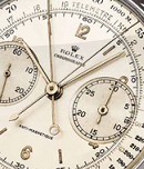
.Non una versione minore del DB29 Maxichrono Tourbillon (https://orologi.forumfree.it/?t=68448198) ma di fatto un orologio diverso, con temperamento più aggressivo suggerito dalla cassa DB28 "basculante" e con corona al 12 e dal quadrante con font più moderni. Cassa rotonda in oro rosa diametro 45 mm combinata a sistema anse in zirconio nero. 
The admirers of the recently introduced DB29 Maxichrono Tourbillon will be happy to know that at BaselWorld 2014 De Bethune presented another mono-pusher chronograph with five central hands, the DB28 Maxichrono. This time without tourbillon and with a DB28 case.
The 45 mm round case is combined with the openworked floating lugs on springs – a De Bethune patented system that adapts them precisely to the shape of the wrist and its movements. The rose gold case makes a sharp contrast with the blackness of its floating lugs in hand-polished, oxidised zirconium.
The skeleton hands in polished black oxidised steel tell the time of day pointing to large black numerals in a modern typeface. The chronograph hands for elapsed hours and minutes are made of flame-blued steel while, for enhanced legibility, rose gold is used for the indicator of the chronograph minutes.
The chronograph pusher is paired with the crown positioned at 12 o'clock.
On the back, the window on the hand wound calibre DB2030, offering 5 days of power reserve, displays the architectural layout of the movement’s bridges in rose gold and polished steel.
Only twenty pieces of the DB28 Maxichrono will be issued in 2014.
Fonte: www.timeandwatches.com/2014/03/de-bethune-db28-maxichrono.html .
. -
=panerai= .
User deleted
Noooooo orrendo . -
.
45mm di orridezza...  .
. -
.
proprio brutto  .
. -
.
Io un De Bethune proprio bruttissimo non riesco mai a trovarlo. Certo non lo prenderei, però... . -
.
 .
. -
.

Eminence of the Forum

- Group
- Member
- Posts
- 12,713
- Location
- Asti\Neuchatel
- Joined
- 20/12/2007
- Status
- Anonymous
mi piace come è realizzato il quadrante e le sfere. Sul resto non mi esprimo . -
.
Se questo é un orologio brutto.......  .
. -
.

 .
. -
.
non mi dispiace anche se ci sono troppe lancette... . -
.
Mi piace molto l'idea, ma gli indici applicati hanno un carattere orribile e la cassa smaltata di nero alle anse è ugualmente brutta, peccato.  .
. -
ciaca .
User deleted
Di spunti interessanti e innovativi ce ne sono a bizzeffe, di scelte estetiche convincenti meno.
Su tutto trionfano le scelte marchettare e modaiole, pvd e diametro da comodino bastano a renderlo l'ennesima occasione persa e l'ennesimo orologio da dimenticatoio.
Saluti. -
.
Bah ..
 Attached Image
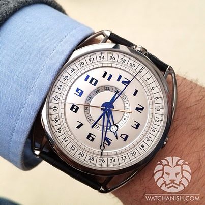 .
. -
.
Orrido . -
.
Forum Divinity
- Group
- Member
- Posts
- 21,362
- Location
- Confoederatio Helvetica VS-VD et De Finibus Terrae (Bassa Terronia Orientale) - S.M. Leuca -
- Joined
- 29/2/2008
- Status
- Anonymous
mi piace come è realizzato il quadrante e le sfere. Sul resto non mi esprimo
Su questo che mi dici..?
.

De Bethune - DB28 Maxichrono |


 Instagram
 Facebook
 YouTube
 Iscritti